6 Web Design Failures that Affect Your SEO and How to Avoid Them

A website is one of the essential digital properties for businesses of a new generation and the design plays a crucial role in making your website interactive and engaging to visitors.
Today, marketers also need to take care of that their websites rank higher in search engine results and Website Design can help them do so.
Avoid these six design mistakes that negatively affect your SEO.
1. Avoid Mobile Responsiveness
Today, 50% of all internet traffic comes from mobile. So, while you are brainstorming how to make your website appealing for desktop users, ensure that it also works appropriately on small-screen devices like mobile, tablets, etc.
A mobile-responsive design would work properly, and the elements won’t look vague or cluttered in small devices.
Google has also confirmed that it supports mobile first indexing, so if your website is not mobile responsive, your indexing and ranking would be affected.
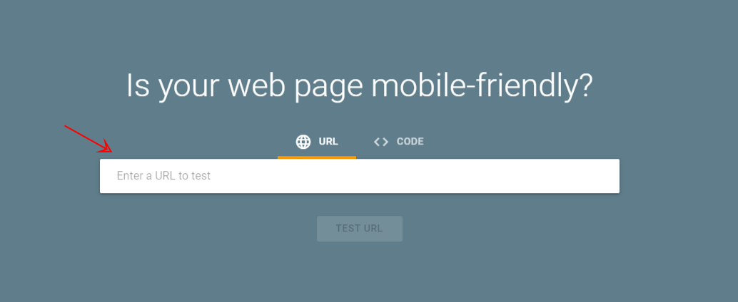
Use a Mobile-Friendly Test tool to determine whether your website is mobile friendly.

You can place your URL in the mentioned search bar to run the test.
2. Slow Loading Speed
If users have to wait to access your webpages, they will get lousy user experience and may also leave your website and may never visit again.
So, your website loads as quickly as possible, so avoid using unnecessary elements like animations, images or videos that consume a lot of time to load.
Search engine giant Google has also confirmed that website loading speed is a ranking factor.
3. Not Making It Fluid
Fluid design connects enables unified web experience, and your users feel that they are interacting with a purpose-driven online resource. More importantly, a thought-out layout grabs the attention of the user.
According to Microsoft, the attention span of a normal human being is less than 10 seconds. So, if you fail to grab the focus of the user in the first seconds, you will lose the game.
4. Underestimating the Power of Multimedia
Ultimately, the purpose of your website design is to send the right message as elegantly as possible.
Based on your marketing objectives and plans, you can publish researched and long articles and blogs to educate and pursue users. However, you must also add relevant images or videos to back your claims and communicate complex messages effectively.
Relevant images or design elements can maintain users’ interest and encourage them to go all the way down and read the complete page and perform conversions.
5. Giving Poor Navigation
Organizing your website that makes users feel lost and stuck would put your website in a dangerous position because visitor would leave your website and your bounce rate and sessions would be affected.
Brainstorm the navigation of your website to ensure that users can go from one page to another effortlessly and also let them find anything they want without any confusion.
You can mention relevant resource of your website on particular web pages so that users can access them to find out more. Also, this would improve the number of sessions and the overall time spent on your website.
Mentioning your other webpage’s links would also allow crawlers to effectively crawl your website and understand the structure.
6. Undermining Call-to-Action
Call-to-Actions is one of the essential elements of any websites because call-to-actions inspires visitors to perform your desirable subsequent actions after reading your webpage.
It could be anything — subscribing to your newsletter, following your brand on social media, buying your stuff, visiting your offline store or generating social media shares.
Make sure that your layout must have a prominent call-to-action that encourages users to take specific actions after interacting with a webpage.
Conclusion
“You need to keep experimenting design layouts and determining the response of the visitors. Decide what works for your website and stick to it. “
Feel free to share your thoughts in the comments about what do you think of the design failures discussed in the article.

.png)
Comments 0 comment